I recently found a site called Datanyze that utilizes a crawling technology to review technology for top websites, and more specifically what technologies different sites use. While originally I was going to focus this post on the utility of WordPress as I started poke around I saw some interesting things that I thought were noteworthy in terms of how various sites use technologies in different ways.
With the fast moving nature of technology I suspect that many of these charts will change dramatically over the years, as I’m sure they have looking back over the years…. A last note on the below charts that I have chosen to select – when I say “top” I’m not making a claim as to what is the best but rather what is used the most in a particular instance.
So here goes, as of July 12, 2013, according to chart and data generated by Datanyze. The commentary is mine… In addition be sure to scroll down below as I share some thoughts on why data like this is important for all web owners and stake holders regardless of if you are a “tech” person or not.
CMS Market Share
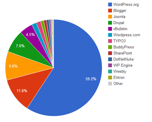
Clearly the trend is heavily in favor of WordPress – which alone commands a greater percentage of use than all the other CMS platforms combines. Wow! Here is direct link to this chart.
Comments Market Share
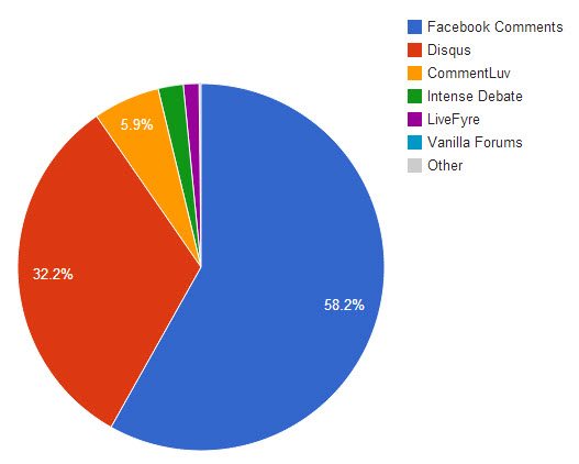
Another trend here, clearly this time in favor of Facebook. I’d be curious to know how sites using Facebook comments are seeing results from referral traffic directly back to their sites. I’ve seen most of these commenting systems work with WordPress sites, and what is interesting is that while many commenting systems work on top of WordPress (meaning site owners “own” their comments), Facebook does not (Facebook “owns” the comments) and despite that clearly a big number of sites are willing to give this up in order to bring Facebook comments on to their sites. An impressive feat considering how young Facebook comments are! Here is a direct link to this chart.
Analytics Market Share
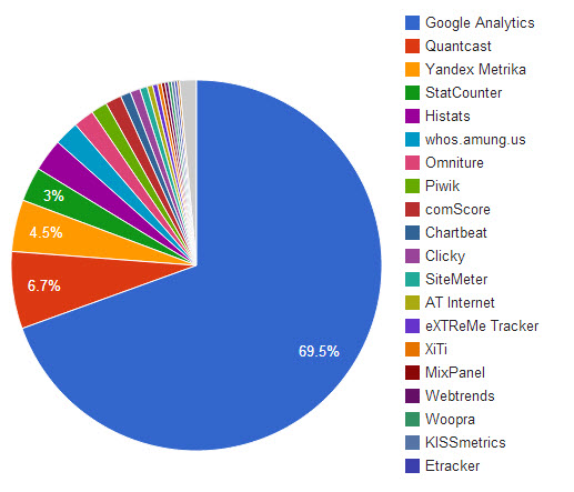
In terms of Analytics, Google Analytics is a clear winner, but what impressed me about this particular search was the number of possible solutions available for web measurement. Some of these platforms work on top or in concert with Google Analytics, but the spread between #1 and #2 versus #2 and #3 is quite dramatic. Here is a direct link to this chart.
Email Marketing Market Share
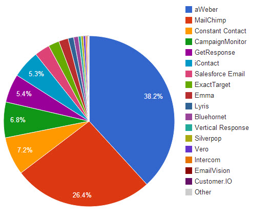
The finding from this chart surprised me a bit as I did not expect to see AWeber in the top spot but there you have it. Again a nice array of choice here and it also seems that the spread in this category is not as stark as we’ve seen in the other charts. Here is a direct link to this chart.
So What You Ask?
So we have all these charts but what exactly are we supposed to take away from all this? The answer really depends on your situation, but if you’ve seen the video I put together for “Digital Identity Management” you might have seen how big a role I place in the value of using the right technologies for specific issues. Clearly the ways in which the top websites use technology should provide all of us with some interesting places to build from. Of course while we can’t always say the “crowd” is always right, often the wisdom of the crowd in terms of technology choices is a good bet….
A few ways to consider this information might be to begin to asses the likelihood that a particular technology is going to stick around? If you deploy a technology that is starting to wane, or to outright disappear as a site owner you are going to be presented with a very “real world” problem that you’ll have to address whether you like it or not.
Another way to look at these charts is to consider that if a particular technology is receiving widespread use, it likely also works at a good level, meaning you can focus on your primary tasks rather than on having to solve for your technology so “winning” technologies might get additional interest as you make your own technology decisions.
In addition, widespread technology tends to have a big ecosystem around it which more often than not means that there are a number of very qualified vendors to help you – a great example being the number of really strong WordPress developers out there. You can also take this same attitude towards pricing in thinking that if there is a big market competition will drive the price of services down although I always caution my client to put quality before price…
If you revisit a chart like this you can also begin to make decisions based on trends and to see how early adopters are using technology and possibly consider making a similar decision early on – often this can provide you with a small edge to your advantage. Technologies that are quickly gaining widespread usage often do so by either performing a task more effectively or by being able to do it for less cost.
Lastly, another great way to use charts like this are simply to be informed – even if you are not a developer, a vendor or a “technology person” these charts can provide you with some great insights that will allow you to better respond to potential vendors – for example if they suggest using the 18th most popular email marketing service you can ask them the simple question of ‘why’ and if you don’t like their answer perhaps that might be a criteria to consider more options.
Feel free to click through to the Datanyze Market Share tab to replicate the result for yourself. In addition you’ll be able to put together a number of other usage charts on things like Hosting, Payments and Onsite Advertising.