In case you ever wondered… how exactly should I put my main blog page together (and you are not alone) we created this diagram and descriptive copy to help address this common pain.
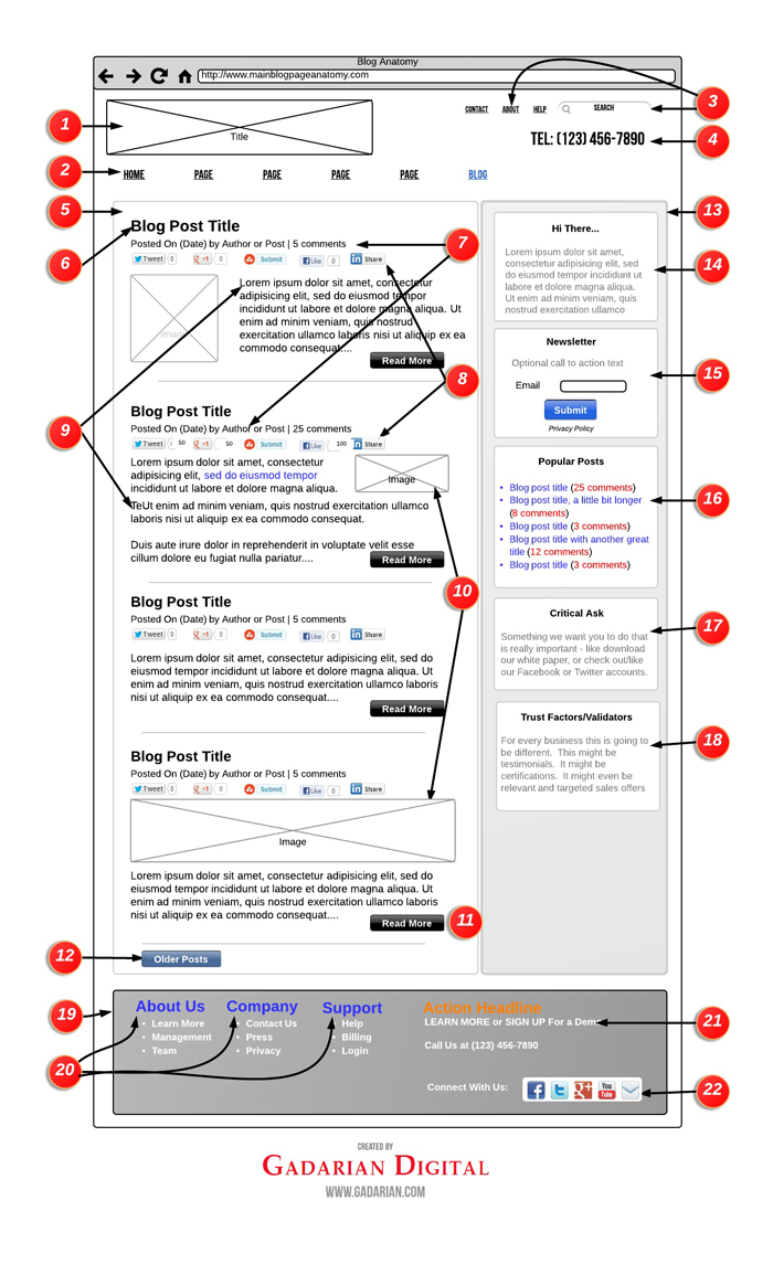
Blog Page Anatomy Diagram
Want to Print Out Your Own Copy of this Diagram:
A Focus on Best Practices
In putting this diagram together I’ve tried to focus on “best” practices. In addition I have included some further insights to help address “why” in specific instances. How you ultimately construct your blog will be based on specific needs and goals of your site, but hopefully this diagram will go a long way in helping you get there.
I also have a very simple rule that I want to share with you – “Form” is wonderful and I do believe that websites should aspire to be beautiful, but “Function” is critical -meaning that your first obligation is to make sure that your visitors can easily read and digest your content. .
While this piece is focused on the “anatomy of a blog,” I have also included header and footer elements as I do think they can add tremendously to how you might approach the construction of your blog. If you wanted to take things further and create custom headers and footers for specific pages, Headway Themes does offer an easy path to doing so.
I am also happy to mention that this post was originally published as a guest post by David Gadarian for Headway Themes (also the WordPress theme that we use here at Gadarian Digital).
Time to Dive Deeper and Get Into the Details
1) Site/Business Name: This is as you would think: the name of your site. A logo or other image of some kind can help, particularly if you are looking to establish a specific tone that you will then use your blog design to further highlight.
2) Main Navigation: I like to place the “Blog” at the very end of the main navigation, particularly for sites with a static homepage. The reason I like to place the blog at the end is because I want it to be as visually present as possible, particularly since the blog is the most dynamic portion of a website, and through a blog, a site owner has multiple opportunities to convey a wide variety of mission-critical ideas.
3) Secondary Navigation: The secondary navigation is something I’ve been featuring more in my sites in part because WordPress has done a great job in allowing site owners a very way to create “custom menus.” Secondary navigation is great because it affords you a nice opportunity to break up your site taxonomy. I’ve found that placing critical services in the main navigation and then placing information based items such as “about” and “contact” in the secondary navigation is a great way to make it easy for different people to quickly find different areas that are relevant to them.
4) Main Contact Area: This particular piece of digital real-estate is critical, as typically your header is site wide (the same header for the entire site.) Many sites like to include their social media accounts here, and again, depending on the business that can be a great idea; but other times less is more, so for many businesses a phone number and nothing else is the most effective use of this space.
5) Blog Body Area: From the blog body area, a site owner has many options and opportunities to really make an impression.
From a visual standpoint, the design of your blog should help reinforce your brand. From an organizational standpoint, the overall display of your blog, and how you place various elements, should serve to further increase the confidence that your readers have in you.
Suddenly, things like color scheme, font size and character spacing really start to take on a level of added urgency. You’ll also want to give some thought to how many posts you want to include on each blog post. Typically the standard is 10 posts, but of late many sites are adopting an “endless scrolling” approach.
6) Blog Post Titles: As a new visitor enters your blog page, they are going to be doing a few things immediately. First, they are going to be scanning your blog to see if they even want to stay. Then, they are going to determine what they want to read. Your Blog Post Titles have a huge impact on this.
You should offer up a nice visual contrast to provide adequate clues to your readers in terms of these are the “really big subjects” on this page. Also, it is critical that you write eye-catching headlines to encourage people to click through.
7) Meta Information: There are so many ways to go with “meta information” that range from what to include to how to style. I like to view the meta information as a series of clues that a site owner can offer a reader to help further convince the reader that this is the post for them.
I like to start with the date, as it provides your readers with a clear signal that you are active and present. Of course for sites that blog very infrequently, I’d recommend not including the date.
“By Author” is another nice meta element. Your readers probably don’t know the writers of your site, but the simple act of including a name says that a post is written by a human rather than a corporate or business “entity.” Being human goes a long way and this little crumb of humanity helps.
The number of comments is probably the biggest signal you can provide regarding the popularity of a particular post. If people are commenting on a post, a visual proof is a very strong indication to visitors on your blog that they too might want to click on that particular post. In the “blog anatomy diagram” you might have noticed that the second post has “25 comments,” which in this case would be a compelling reason for a reader to click through, if only to see what all the excitement is about. Also, with comments you do have some interesting options should you want to take thing a bit further.
8) Social Validations: Another strong signal to “incentivize” your blog page visitors is to include on your main blog page a direct callout to how often a particular post has been shared, inside of various social media outlets.
Again, in our example, the second post has seen considerably more activity on Twitter, Google+ and Facebook, which would be a very compelling additional signal (along with a relevant title and also a high number of comments) that this is a good post to read.
9) Excerpt Text: The Excerpt is “a condensed version of your blog post.” In WordPress there is a default amount of text that will be included (which you can customize.) WordPress offers up a number of ways to manage your excerpts. Headway also offers up some nice options for customizing your excerpts.
I have found that a nice way is to approach excerpts is to set up a default approach that you are happy with and then to, as needed, use the excerpt field that is available when you create a new post in WordPress when you want to include more text.
I’ve also seen some sites include the full version of their most recent post directly on their blog page, but my feeling is that if your readers are on your blog page they are likely there to see a great deal of potential content in a short amount of time. Therefore, I tend to direct my clients to opt for brevity rather than having visitors do some additional scrolling to get past the first post – so generally I recommend not including full posts on your blog.
10) Images: This is another area that is open to a wide array of approaches. Many sites will go for a very linear and organized look and will include a featured image that will align in exactly the same place for each excerpt. For some sites that have enough visual breadth that can be a great approach.
In the sample I’ve put together, instead of the featured image approach, I’ve offered up a variety of image placed in a different positions for each post. This can be accomplished by taking advantage of the custom “excerpt” field that is available when you create (or edit) a post. Just a quick heads up for all the WordPress users – I have yet to be able to figure out how to include a caption in my images with custom excerpts – I’m sure it’s possible, just that it seems to not work when I’ve tried to do it in the past.
While I don’t have any “science” to back this up, I believe that by breaking up the visual images, both in terms of size and placement, you are also encouraging your blog readers’ eyes to move around more, which hopefully means they are even on a subconscious level paying a little more attention to your site.
Also, the simple truth is that some images look better aligned left, while others really fit better aligned right.
11) Read More: This seems pretty straight forward, but it’s actually an important opportunity to add some visual spice to your blog page. A blog page usually consists of 10 excerpts, so in this case we are looking at 10 “read more” buttons. Yet another item that is very easy to customize in Headway.
12) Older Posts (also newer posts if you are not on the front page of your blog): Again, this is pretty self explanatory in terms of function. I recommend using a different color (or shade) than your “Read More” buttons in order to avoid any confusion on the part of the reader.
The confusion factor is critical here, so I’d like to point it out. At this point in a reader’s journey they have either not seen anything they like, they have already read all the posts they are interested in on this blog page (which means they now want to see some more), or they are interested in learning more about your site. This means we want to make sure they head to either the header or, seeing as how they have already scrolled down this far, we make their life easier by including what we think are the important “about us” items in our footer (more on the footer shortly).It is critical that no matter where a reader is in their journey we take great care not to confuse them – for example, not using color contrast between “older posts” and the “read more” buttons. When we introduce confusion on a site, we are also chipping away at the trust our readers have in us.
13) Sidebar: A few items to consider with your blog sidebar include the location (left or right), and the addition of a background color. As the sidebar is persistent (meaning that the sidebar is present both on your main blog page and your single posts), I’m of the belief that placing the sidebar on the right provides a better reading experience. But as we are about to explore, a sidebar provides some critical opportunities for your site to develop an enhanced relationship with a reader, so placing the sidebar on the left might be worth the potential downside of alienating some readers.
The color scheme for your sidebar is also another big consideration. A few elements to explore are the background of the entire sidebar, borders for the sidebar, borders for sidebar elements, font size, font weight (in this example the headlines bolder) and font color (in this example the font color lighter than the font color in the body).
The goal with your sidebar is to provide added value, and to offer up visual aides to help your blog visitors make good reading decisions that will give them a great experience and ultimately encourage them to take an action (to comment, to share, to subscribe, to download, to buy or even to contact you.)
Also, as you are going to see, within your sidebar you are trying to provide an additional experience – so you will want to explore different options in terms of the order of elements and what elements to include. One piece of advice – avoid the temptations of over-burdening your sidebar with too many content items. Doing so will likely encourage a complete lack of action, whereas if you limit what is happening on your sidebar, you are making it that much easier for your visitors to make a decision.
14) You Are Here!: Create a very short introduction box explaining to the visitor what your site is all about. Again – very short.
As you get active with blogging you will begin to see that more and more visitors are starting to enter your site through either your blog posts or your blog page. These visitors are quite likely not familiar with your site, and found these pages through a variety of options including through social media referrals or search engines, so it helps to “introduce yourself.”
The reasoning behind this strategy is to very quickly “pre-qualify” your readers, and also to very quickly provide your readers with some additional context about your site. You want to further qualify readers who are browsing versus readers that might be interested in a longer relationship (i.e. potential leads.)
Readers of any stripe are great and your blog should provide value to ALL your readers, but it is okay to let people know exactly what you do. This strategy has a particular impact on how readers view your blog and also how they view the additional elements of your sidebar. You want interested readers to know exactly what you do, as they are likely to be even more interested in having a relationship with you.
15) Subscribe: On many blogs you will see the request/offer to subscribe feature very prominently, and sometimes often. The reasoning is that, unlike other opportunities for further engagement, your newsletter list is something that you as a site owner actually own. Therefore the need to capture opt-in requests is critical; it is through these lists that you can then begin to regularly contact your fan base (and let them know about events, subsequent blog posts and other related developments.)
With so much at stake, it is clear why the newsletter subscribe box is usually found “above the fold”. If you are going to get serious about your online newsletter efforts, take some time and do your homework – there is a ton of information out there so make the most of it!
16) Popular Posts: In this space where you might want to include either “Popular Posts” or “Recent Posts.”Some sites even offer up a “hand selected” version showcasing the site owners favorite posts. In any event the benefit for this is to make it easy for people to scan and see “what you are all about” and also to find other great articles you have written.
Also note in this example the change of color on the text of the posts (they are links so they are blue) and the additional contrast by making the color of the comments red. Again – you want to provide your readers with clear signals about relevancy.
17) Critical Ask: This single box might be the most important piece of your entire blog. It might be so important that your entire site hinges on it. That said, if you have a desire to see it “convert,” it is important that you do everything you can to convince your readers that your “ask” is worthy of their time, and in this scenario that starts with an amazing blog that delivers tremendous value. So by the time you make your “Ask” you have already started off on a great foot with your readers.
And I know for many of you the inclination is to include that “Facebook” box right there, and for some sites that is a great idea, but for many sites the success or failure has nothing to do with your Facebook audience (or for that matter any other social stream) so you want to make sure you make wise and economic use of this area of your blog.
18) Trust Factors: This is a great opportunity to further validate your “Critical Ask” either through testimonials, or to showcase specific accreditations to further bolster your “expert” positioning.
If you want to utilize this area to “sell” products – either yours or third party products – that is great; just make sure that the products are top shelf, and also that in some way the products you are providing access to in some way further bolsters the entire “story” of your site. Showcasing amazing products can also go a long way in helping in to reinforce your value as a trusted source.
19) Footer: There are a number of factors to consider with your footer, but as this element is usually a site wide element there is real value in “getting it right.”
A few form factors to consider are color scheme, font sizes and font weights. In this example there is a darker background and also the Main Navigation elements use two different colors (blue and orange) to offer up even more contrast. The footer body text is white.
By the time a reader has made it to your footer, assuming they are still actively engaged, they likely are starting to get into the “learn more” mode so do your best to address this quickly and concisely.
20) Footer Headlines: In this example we are not trying to rehash their entire site experience. Instead the goal is to provide readers with easy access to some of what we think might be their “common” questions. Again, the color contrast allows the reader to make a quick decision – is the reader at the right place or does the reader need to keep looking?
21) Request for Action/Contact Info: In some instances you might have something really special that you want to call out, such as a white paper or an exclusive offer. This is another nice opportunity to offer up the access to this piece, but even more so to continue to position yourself as a field matter expert.
This is also a good opportunity to provide your contact information one last time.
22) Social Follow: Links to your various social media channels. Again though we are in the footer, so likely the intent of your readers is less about “follow” and more focused on trying to learn more about you. By now you’ve provided them with an amazing experience so it’s important to continue to build on that with some well realized social media efforts. Also, while this post was originally written in 2012, I’d like to highlight the fact that in most cases we do strongly advocate for placing social media follow buttons in the footer rather then the header – the reason being you own your website but unless you are a stockholder you do not own any of the core social media sites so strong thought should be given to how you prioritize elements on your site versus the lifetime value these elements can deliver.
And there you have it – a pretty deep review of how to format your blog pages utilizing best practices, common sense and some hard realized lessons from the trenches.
Also – If you liked this piece don’t forget to check out The Anatomy of A Single Blog Post piece we did as well if you haven’t yet seen it!
[…] is a follow up to my recently published “Anatomy of a Blog Page”. If you’ve already seen that piece, don’t worry, there is plenty of “new” […]
[…] Anatomy of a blog […]