Curious about how to format you blog posts? Hopefully this blog post will help shed some light on the entire process.
Blog Post Anatomy Diagram
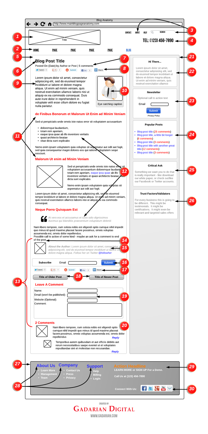
Want to Print Out Your Own Copy of this Diagram:
Formatting Your Blog Pages – Overview
This is a follow up to my recently published “Anatomy of a Blog Page”. If you’ve already seen that piece, don’t worry, there is plenty of “new” here.
I’ve tried to focus on “best” practices. I have also included additional insights to help address “why” in specific instances. How you ultimately construct your blog posts will be based on specific needs and goals of your site, but hopefully this diagram and explanation will go a long way in helping you get there.
A Breakdown of How To Format Your Blog Posts
1) Site/Business Name: This is as you would think: the name of your site. Make this easy to read – you do not want to introduce any confusion to your readers at the very top of your site. A logo or other image of some kind can help. A confusing logo can hurt.
2) Main Navigation: I like to place the “Blog” at the very end of the main navigation, particularly for sites with a static homepage. The reason I like to place the blog at the end is because I want it to be as visually present as possible, particularly since the blog is the most dynamic portion of a website, and through a blog, a site owner has multiple opportunities to convey a wide variety of mission-critical ideas.
3) Secondary Navigation: The secondary navigation is something I’ve been featuring more in my sites in part because WordPress has done a great job in allowing site owners a easy way to create “custom menus.” Secondary navigation is great because it affords you a nice opportunity to break up your site taxonomy. I’ve found that placing critical services in the main navigation and then placing information based items such as “about” and “contact” in the secondary navigation is a great way to make it easy for different people to quickly find different areas that are relevant to them.
4) Main Contact Area: This particular piece of digital real-estate is critical, as typically your header is site wide (the same header for the entire site.) Many sites like to include their social media accounts here, and again, depending on the business that can be a great idea; but other times less is more, so for many businesses a phone number and nothing else is the most effective use of this space.
5) Blog Post Area (Body): From the blog post body area, a site owner has many options and opportunities to really make an impression.
From a visual standpoint, the design should help reinforce your brand. From an organizational standpoint, the overall display, and how you place various elements, should serve to further increase the confidence that your readers have in you. You also have an opportunity to potentially influence outcomes based on how you organize your blog posts body area.
Suddenly, things like color scheme, font size and character spacing really start to take on a level of added urgency.
It is also critical to keep in mind that many of your blog post visitors are entering your site directly through your posts so making sure that everything is pretty easy to find is important. If you are going to break what is considered a typical convention with your posts you’d better make sure you have a great reason for doing so, particularly as your visitors have certain expectations based on reading many other blog posts on many other websites.
Also other factors to consider are the length of your paragraphs, how you break up your post (for lack of a better word we’ll call it “chunking”) and also additional visual hints you provide for your readers to better help them digest your post.
6) Blog Post Title: As a new visitor enters this page, they are going to be doing a few things immediately. After reading the name of your site (The Site Title), the next thing they are going to read is the title of your post to see if they even want to stay.
If you don’t do a good job with your title the likelihood of a visitor staying to read your post goes way down. This decision happens very quickly so it is critical that you spend enough time crafting really compelling titles for your posts.
It is also important to provide some visual contrast for your title so that it is easy to find.
7) Meta Information: There are so many ways to go with “meta information” that range from what to include to how to style. I like to view the meta information as a series of clues that a site owner can offer a reader to help further convince the reader that this is the post for them.
I like to start with the date, as it provides your readers with a clear signal that you are active and present. Particularly for new posts, there is something nice about letting your visitors have a “hot off the presses” appreciation for very recent posts. Of course for sites that blog very infrequently, I’d recommend not including the date.
“By Author” is another nice meta element. Your readers probably don’t know the writers of your site, but the simple act of including a name says that a post is written by a human rather than a corporate or business “entity.” Being human goes a long way and this little crumb of humanity helps.
The number of comments is probably the biggest signal you can provide regarding the popularity of a particular post. If people are commenting on a post, a visual proof of the number of comments can provide a strong indication to visitors that they too might want to continue reading to the end. Also, often when there are enough comments it offers up an additional incentive to new readers to stick around so that they too can benefit from the wisdom of your audience.
8) Social Share Bar. Another strong signal to “incentivize” your visitors is to include a direct callout to how often a particular post has been shared inside of various social media outlets.
In addition it is important to really consider the placement – you want to make it easy for your visitors to share, and also, by going full width on the social share bar it also increases the likelihood the your visitors mouse will pass over this section of your site – again – you want to make it easy for your visitors to share your content should they choose to do so.
9) Beginning of Post: Here it is critical that you hook your readers early. They have not yet fully committed to reading your post at this stage so it is important to quickly assure your readers that they have come to the right place, and that whatever you outline in your title is what this post is really about.
10) Image: It is critical to appreciate that the images, particularly those “above the fold” are going to be among, if not the most prominent elements of your post. A great image goes a long way. And so does a great caption. Again, as we are still early in the post you still need to assure your readers that they are at the right page so the image (and caption) carry a great deal of weight.
Also, consider the alignment of your images. Some images look better on the left and others on the right. I tend to place most of my first images to the right mainly because I try to make it as easy as possibly for readers to start reading.
Another big consideration with regard to images is that they stick out like a sore thumb – and that is a good thing in this case! Especially early in your posts, the images (and the captions) will be among the first things viewed so make the most of this opportunity.
In the case of this particular image in our sample, the guy is actually facing towards the area we want readers to concentrate on – the body of your post – in essence his line of sight is directing your readers to where you’d like them to go.
11) Headlines. Headlines throughout your post is another great way to provide some nice contrast, to contribute to the overall flow of your post and also to offer up another very quick way for readers to “cheat” ahead.
When considering your headlines within your post give some real consideration to font sizes, font colors and even padding. You’ll want to create very clear visual breaks that can enhance the overall reading experience.
12) Easy Visual Skims: Within the body of your post take advantage of bullets, numbers and even quotes to offer up additional visual diversity. These techniques also make enhance the overall readability of your posts.
In some instances it might even make sense to consider offering up even more contrast through different font colors, font sizes and even italics.
Writing for online is not the same as more traditional writing so offering up some nice visual breaks is a great way to keep the eye of your visitor engaged (reading long paragraphs online can be hard for many readers) while also building on the “chunking” idea mentioned above.
13) Bottom of Post: Up until know the bulk of the hard work has been done by you. Assuming you’ve done a great job with your post, you probably want your readers to do something. To share. To subscribe. To comment. Maybe even to purchase. The truly interactive part of blogging begins here.
As you can see from the diagram, this also happens to be a bit of a traffic jam area in terms of our “ask” of the reader. It’s important that you find the right balance here – if you offer up too many choices you do run the risk of overwhelming your reader in which case they might opt to simply walk away.
14) Call to Action: This is completely optional, but there are times where it might help to ask a specific question of your readers in order to try and generate some additional dialogue. A simple invitation to comment with a “what do you think” or “please share your own stories below” can work wonders.
15) Author Bio: If you are running a single author blog this is probably not necessary, but for multi-author blogs it does add a great deal to the overall experience.
16) Subscribe Bar: This is where you provide your readers with a very easy opportunity to subscribe to your newsletter. More on why this is important in section #23 below.
The placement is also important to note – at this stage in the reader’s journey you have likely provided them with a captivating blog post so they are very primed to take another step in the relationship. Also note that again, this is a full width bar, so if your reader has any intention of continuing on with the post their eyes have to pass over this bar – by going full width you are essentially forcing your readers to make a decision.
Also as this is the first “ask” you are making of your readers following the end of your post it is important that you utilize this space wisely. So the first “ask” could be other elements such as a promotion, or even an ad for a third party product.
17) Social Share Bar (Again!): At this stage, unlike at the top of the post where the social share bar is also a signal for new readers, at the bottom of the post the social share bar is really an opportunity for your readers to share this post now that they are most qualified to share it – after they’ve read it.
Again, we are utilizing a full-width approach here. That is not to say this is the only way to go, particularly as I know that persistent vertical bars are pretty popular now. Whatever you think will work best. But in today’s world, as a blog owner it is critical that your offer up easy ways for your readers to share your posts and also that you feature more prominently whatever social networks are most relevant to your particular audience.
18) Most Recent Posts: Provide your readers with easy access to the most recent posts your blog has published. You’ve done such a great job that perhaps they want to read more and engage a little deeper.
19) Comment Form: There is a wide array of comment options available that can add nice features to the pre-installed WordPress commenting system and there is even a wide array of alternate commenting systems available.
Some commenting systems integrate very nicely with social networks, others offer site owners a greater degree of options, and yet others are literal extensions of social networks (Facebook comments.)
A few big consideration are ease of use (both your readers and your own), ability to moderate and portability (meaning that if you change your mind and implement a new commenting system down the road will you be able to keep your existing comments on your site.) Another big consideration is the ability for a commenting system to allow your readers to “follow” a conversation so that they will receive notifications in the event of any new comments.
No easy answers here. I will say though that most readers expect that comments will be listed in the order they were posted. In addition to meeting reader expectations, having your comments listed on your site in the order that they were posted will provide for a much easier reading experience to those wanting to see how the dialogue evolves.
20) Threaded Comments: In addition to offering up a way for your readers to comment on your posts it is also important to consider how others can respond to comments.
What makes threaded comments so great is that it allows the commenter of a post to get really invested in it – not only are they so interested in the post that they went so far as to comment, but now they are also invited to become an active participant in the ongoing nature of the post as a result of being engaged with others that have also commented. For a site owner this is a home run as you have now delivered a “comment worthy” post and you have also exposed your readers to some additional great ideas as a result of your amazing audience.
21)Sidebar: A few items to consider with your blog sidebar include the location (left or right), and the addition of a background color. As the sidebar is persistent (meaning that the sidebar is present both on your main blog page and your single posts), I’m of the belief that placing the sidebar on the right provides a better reading experience. But as we are about to explore, a sidebar provides some critical opportunities for your site to develop an enhanced relationship with a reader, so placing the sidebar on the left might be worth the potential downside of alienating some readers.
The color scheme for your sidebar is also another big consideration. A few elements to explore are the background of the entire sidebar, borders for the sidebar, borders for sidebar elements, font size, font weight (in this example the headlines bolder) and font color (in this example the font color lighter than the font color in the body).
The goal with your sidebar is to provide added value, and to offer up visual aides to help your blog visitors make good reading decisions that will give them a great experience and ultimately encourage them to take an action (to comment, to share, to subscribe, to download, to buy or even to contact you.)
Also, as you are going to see, within your sidebar you are trying to provide an additional experience – so you will want to explore different options in terms of the order of elements and what elements to include. One piece of advice – avoid the temptations of over-burdening your sidebar with too many content items. Doing so will likely encourage a complete lack of action, whereas if you limit what is happening on your sidebar, you are making it that much easier for your visitors to make a decision.
22) You Are Here!: Create a very short introduction box explaining to the visitor what your site is all about. Again – very short. Right now I’m not seeing a great deal of this on blogs but I think that is about to change.
As you get active with blogging you will begin to see that more and more visitors are starting to enter your site through either your blog posts or your blog page. These visitors are quite likely not familiar with your site, and found these pages through a variety of options including through social media referrals or search engines, so it helps to “introduce yourself.”
The reasoning behind this strategy is to very quickly “pre-qualify” your readers, and also to very quickly provide your readers with some additional context about your site. You want to further qualify readers who are browsing versus readers that might be interested in a longer relationship (i.e. potential leads.)
Readers of any stripe are great and your blog should provide value to ALL your readers, but it is okay to let people know exactly what you do. This strategy has a particular impact on how readers view your blog and also how they view the additional elements of your sidebar. You want interested readers to know exactly what you do, as they are likely to be even more interested in having a relationship with you.
23) Subscribe: On many blogs you will see the request/offer to subscribe feature very prominently, and sometimes often. The reasoning is that, unlike other opportunities for further engagement, your newsletter list is something that you as a site owner actually own. Therefore the need to capture opt-in requests is critical; it is through these lists that you can then begin to regularly contact your fan base (and let them know about events, subsequent blog posts and other related developments.)
With so much at stake, it is clear why the newsletter subscribe box is usually found “above the fold” (and in this sample scenario we also included an opportunity to subscribe to the newsletter at the conclusion of the post.) If you are going to get serious about your online newsletter efforts, take some time and do your homework – there is a ton of information out there so make the most of it!
24) Popular Posts: In this space where you might want to include either “Popular Posts” or “Recent Posts.”Some sites even offer up a “hand selected” version showcasing the site owner’s favorite posts. In any event the benefit for this is to make it easy for people to scan and see “what you are all about” and also to find other great articles you have written.
Also note in this example the change of color on the text of the posts (they are links so they are blue) and the additional contrast by making the color of the comments red. Again – you want to provide your readers with clear signals about relevancy.
25) Critical Ask. This single box might be the most important piece of your entire blog. It might be so important that your entire site hinges on it. That said, if you have a desire to see it “convert,” it is important that you do everything you can to convince your readers that your “ask” is worthy of their time, and in this scenario that starts with an amazing blog that delivers tremendous value. So by the time you make your “Ask” you have already started off on a great foot with your readers.
And I know for many of you the inclination is to include that “Facebook” box right there, and for some sites that is a great idea, but for many sites the success or failure has nothing to do with your Facebook audience (or for that matter any other social stream) so you want to make sure you make wise and economic use of this area of your blog.
26) Trust Factors. This is a great opportunity to further validate your “Critical Ask” either through testimonials, or to showcase specific accreditations to further bolster your “expert” positioning.
If you want to utilize this area to “sell” products – either yours or third party products – that is great; just make sure that the products are top shelf, and also that the products you are promoting in some way further bolsters the entire “story” of your site. Showcasing amazing products can also go a long way in helping in to reinforce your value as a trusted source.
27) Footer. There are a number of factors to consider with your footer, but as this element is usually a site wide element there is real value in “getting it right.”
A few form factors to consider are color scheme, font sizes and font weights. In this example there is a darker background and also the Main Navigation elements use two different colors (blue and orange) to offer up even more contrast. The footer body text is white.
By the time a reader has made it to your footer, assuming they are still actively engaged, they likely are starting to get into the “learn more” mode so do your best to address this quickly and concisely.
28) Footer Headlines. In this example we are not trying to rehash their entire site experience. Instead the goal is to provide readers with easy access to some of what we think might be their “common” questions. Again, the color contrast allows the reader to make a quick decision – is the reader at the right place or does the reader need to keep looking?
29) Request for Action/Contact Info. In some instances you might have something really special that you want to call out, such as a white paper or an exclusive offer. This is another nice opportunity to offer up the access to this piece, but even more so to continue to position yourself as a field matter expert.
This is also a good opportunity to provide your contact information one last time.
30) Social Follow. Links to your various social media channels. Again though we are in the footer, so likely the intent of your readers is less about “follow” and more focused on trying to learn more about you. By now you’ve provided them with an amazing experience so it’s important to continue to build on that with some well realized social media efforts.
Conclusion
In putting this diagram together I’ve tried to focus on “best” practices. In addition I have included some further insights to help address “why” in specific instances. How you ultimately construct your blog will be based on specific needs and goals of your site, but hopefully this diagram will go a long way in helping you get there.
While this piece is focused on the “anatomy of a blog,” I have also included header and footer elements as I do think they can add tremendously to how you might approach the construction of your blog. If you wanted to take things further and create custom headers and footers for specific pages, Headway does offer an easy path to doing so.
To Read the full transcript with detailed descriptions as it originally was published, please head over to the Headway Blog where we initially wrote this as a guest post for them.
Also – If you liked this piece don’t forget to check out The Anatomy of A Single Blog Page piece we did as well if you haven’t yet seen it!